New highs new lows

This is an old school breadth indicator that I have toyed around with from time to time but not made part of my routine - until now. 

10 day average of new highs in blue; new lows in red.

26 50 NHNL.png

I reviewed data as far back as I could go - here are some guiding principles:

1. In a bull market environment, buy the time new lows cross over new highs, most damage is done. In other words, shifting bearish at these crosses is too late. 

2. When new highs again exceed new lows, this is often the right time to go back to "confirmed bullish" on the rally. Let's say market has stabilized after a pullback; if new highs are exceeding new lows, no hesitation in being fully bullish. 

3. When new highs gradually decline as new lows gradually increase, there can be more damage on the next drop. This happened in 2015 before the summer drop, and late 2015 before the January 2016 plunge, etc.

4. Many divergences on new highs before a real top; divergence in new lows is a helpful bottom signal. For example, 2/12/2016 significantly less new lows than 1/21 area.

Current assessment:

New lows have been rising since since late July all the way to 8/21. The cross of new lows exceeding new highs was about 8/15-16. The market is not "in the clear" until new highs exceed new lows. Should that happen, point in bulls favor. 

Technical sell?

The case for some pullback as the next move has a few elements. One criterion is technicals on weekly SPY:

RSI 70+ and
Upper BB tag

Arrows on charts below are about where these both occurred; if a cluster of consecutive weeks met conditions, there is still one arrow so this is more visual than quantitative. Just reaching upper band or RSI 70+ alone did not count; both had to happen at the same time.

The most important tops in 2000, 2007, 2011 and 2015 all occurred with RSI well under 70 - divergence being the critical issue. Still, a trend has to slow before reversing and the possibility of a pullback worth hedging is what we are assessing here. 

Starting with recent years, the first thing to notice in the chart below is that the weekly RSI was under 70 from 7/2014 all the way to Q1 2017. Just reaching 70 is not of itself negative; stronger markets will reach overbought several times. It is the reaction to the level and potential divergence that matters.

Still, even in a power up period like 2013 (QE!), the combination of upper BB tag and RSI 70+ is where the pullbacks began. In some cases, the market pushed the band for several weeks before dropping. Often any push outside the band was followed by a divergence high inside the band. 

2013-current

2008-13
3 of 4 incidences at major trading highs, but a different environment then compared to now.

2003-07
Aside from 2003, the real recovery after recession, RSI had trouble when it reached overbought; a real tell for what was to come. 2006 and 2007 saw pullbacks after RSI 70 and weekly BB tag, though in two of three cases market continued higher to make a divergence high before the drop. 

23 12 SPY W.png

1995-2000
This is probably the most relevant chart considering current market. Obviously I am not bothering with 2000-02.

In 1995, the entire year pushed the upper Bollinger band and RSI overbought! After that, SPY RSI reached 70+ many times and pushed the upper weekly band even more times. Often divergence in both proceeded the pullbacks, though the nicely rising moving average lines snapped back so many times before the market rolled over. 

The point here is that a strong market can ignore the weekly band and RSI 70+, and we could certainly experience that here. If higher, then watching for divergence; if lower a real correction would take SPY to weekly 20MA, which has not tagged since 11/2016. 

23 14 SPY W.png

NDX

File this under Other technicals.

NDX is in the middle of an amazing run outside the monthly Bollinger band. Using this index alone, there are only a few times to see 3+ consecutive closes outside these bands. By my count here are past incidences. 

1995 March to 1995 August - 6 months outside the band. Of course this was the start of a massive move in tech, but before this run resumed the index did pause for sideways for about 5 months. 

21 50 NDX.png

1998 Nov to 1999 Jan had three huge jumps, and 3 consecutive closes outside the band. Feb 1999 dropped back inside, but was a pullback low in the middle of screaming up. 

The index started to jump outside the band again in late 1999. Nov, Dec, Jan 2000 down but still looks to be close outside, then two more bars outside for 5 total. Everyone knows the rest of the story. 

21 52 NDX W.png

The only other times to have these kinds of power moves were late 2013 in the QE power up and now, the huge streak as NDX 100 has finally cleared its 2000 top. 

On the plus side, only 1 of the past incidences was a major top. However, some pullback as the market drops back inside the bands is quite a possibility. How far that goes is impossible to know in advance - anything above a rising 10MA keeps trend strongly up.

21 54 NDX M.png

Divergence

RSI divergence on SPY weekly chart pretty clear here. This doesn't get every top but it is often there on high tests that matter. We can add in BB divergence because 2/27 week top tagged the band and this high entirely inside thus far. 

Note the positive examples on the lows in early 2016 - slightly lower price lows yet closing inside the band and higher RSI compared to Septepmber 2014. 

Average true range

File this under my list of "other technicals" - multiple moving averages across time-frames, RSI, Bollinger bands (first three are the basics), advance-decline volume difference, and average true range, and let's throw in Elliott wave structure in there too.

If time permitted % of stocks above/below D50MA / D200MA would be helpful, but if at a fund I would just do it via pivots across all stocks in the indexes. Ie, in all the S&P500 what is the pivot status of each stock? And what is the sector picture? It would be likely to see the component message before the index message, or at least confirming. 

I digress. Here is the average true range on the weekly SPY chart, with a red line shown at current level and arrows on SPY where the market has reached this level during 2009+. 

Like the other technical indicators, there is not just one thing and nothing is ever 100%. Here's the list of the arrows:

March 2010, few weeks from major top and correction
Dec 2010, market higher for several months into April 2011, but not by much
Oct 2012, middle of mild drop
Jan 2013, no damage in middle of QE run higher
Nov 2013, higher but not by much, mild drop Jan 2014
June 2014, preceded mild drop
Aug 2014, preceded correction

And now. A lot of the mild pullbacks above tested the weekly 20MA and the larger drops went to the lower BB or 50MA. We just had a test of the weekly 20MA, so if the market was setting up for larger drop then lower BB & 50MA are both 222-224 and rising. Or the more positive version could play out, higher but not by much and several weeks or months of consolidation. 

I confess that the same indicator in the 2004-07 rally didn't work as well, because so much of the climb was very dull and so a lot of the weeks were lower range. Going back to the 1995 rally, the reason why VIX was increasing was because average true range was increasing as well. Does this mean the chart above is more an anomaly than true market condition? Perhaps, but this is why no indicator can be understood in isolation, and why I am trying to build a picture of the most likely path forward given the collection of these tools - pivots, other technicals, valuation & fundamentals, sentiment and timing - all applied to stocks, safe havens, sectors, global indexes, currencies & commodities.

Down

File this under "Other technicals."

It has been a while since we have seen risk assets down for the quarter and month. As it happens this is happening across the board, with safe havens positive for the quarter and month thus far. 

Markets can come back evidenced by 2016 Q1 which began January in this condition. It took more than a -10% drop and buyers near YS1s and monthly 50MAs, then a huge recovery in March to turn the quarterly bar positive. 

SPX is -3.28% tick to tick for ~18 trading days, and -2.75% close to close for ~32 days. Where and when will buyers step in this time? 5% from highs would be about 2280. This is also near Q2S1. This is not a forecast, just a possibility. 

15 52 SPX Q.png

Important stock market tops - summary

I've made a series of posts on tops in the Dow to investigate whether there are consistent technical signatures. Also it is so easy to pull up charts that I figure that almost everyone is very familiar with 2000 and 2007 due to recency bias. Expectations of a similar set up may not happen.

Let's try to think about some core principles.

1. Is market is blow-off phase? 1929 Dow, 1955-56 Dow, 1989 NKY, 2000 NDX, 2007 SHComp, 2015 XBI? 
Blow-off is most easily defined by quarterly RSI 2 quarters 85+. If so, then typically the drop that follows is dramatic. 1955-56 is the outlier here. 

This isn't the case now in 2017. 

2. Is market in a range? This is a weaker top by definition - at previous highs or lower. 1946 Dow, 2007 SPX. 
Also not the case. Most USA main indexes took out the previous range highs in 2013. NDX more recently, and NYA also different structure. NYA also had a much bigger pop higher in 2007 due to global stock inclusion. NDX above its 2000 top is really helping the bull case. There has been a powerful rally above that level and return to 4816 does not look likely anytime soon.

3. Quarterly chart BB & RSI divergence? Monthly chart BB & RSI divergence? Pivot long term level rejection and/or level fail, then break of YP? 

To my eyes, no Q or M chart RSI or BB divergence. This means we are typically more likely to see higher highs ahead to set up those divergence highs. Sometimes there are tops that don't give good indications. More of those are in ranges. Some really do come out of the blue (technically speaking) like 1987.

The more pesky thing is that there are several incidences of seeming BB and RSI divergence setups that don't produce a high. That said, the signature is more likely to produce a meaningful top when it occurs on both quarterly and monthly charts together. 

The real question here - impossible to answer - is whether stocks prematurely broke out of ranges due to global QE, and may lack the technical signatures of true breakouts on the next major top. Perhaps! 

The other thing is that I'd like to chart valuations of pre-IPO companies like Uber and AirB&B, and let's throw Snapchat in this category too. I suspect the parabolic curve is there - yet some not in existence long enough to even have quarterly chart RSI! The beneficiaries of these trends are founders, early stage investors, a circle of well placed employees, and board members - generally not the retail investing public. Sure, FB buyers have done well - after several months and -40% drawdown. Also, for every FB, think TWTR, GPRO, etc. 

But let's keep it simple - long term pivot level rejections merit caution, but usually the real damage happens when multiple indexes are below yearly pivots. Markets made that move in 2016, went down to YS1s (mostly, RUT on YS2) and recovered. There is no telling when it will happen again, but bulls have earned benefit of the doubt with virtually all risk asset indexes above YPs.

Once in a while there is an outlier like 1987 - a dramatic move, not many clues, all above yearly pivot. It is quite rare but if you are following my comments on pivot rejections and VIX at least you would likely be decently hedged. 

Important stock market tops - part 5

Of course, 1987. This was a real scar for people due to sheer velocity, even though hindsight makes it so much easier with full recovery 2-3 years later.

Again this is important for what is not on this top. 

12 8 INDU M.png

Quarterly chart RSI blowoff levels near 90? No, only 1 bar at 86 and others under 85. This is not so high compared to the other historical blowoffs like 1929, 1989 Nikkei, 1999 NDX, etc.

Q chart BB or RSI divergence? Nope.
M chart BB or RSI divergence? Nope. 

Pivots? A bit helpful, with YR2 rejection. 2 weeks later down to YP that held. The next year back above YP and rally resumed!

Important stock market tops - part 4

Here we look at 3 tops from 1961-72, with the quarterly and monthly charts below.  


12 1 INDU Q.png
12 3 INDU M.png

Starting with 1961 Q4 top - which was the third big top in the massive run from 1949 lows to 1966 highs. This top probably doesn't get much attention because the market was down for only 2 quarters and came right back to higher highs in 2 years. But at the time it was -25% and for a little while anyone who had bought 1959+ was under water.

Quarterly chart BB & RSI divergence? Check on both, classic.
Monthly chart same? Definitely, though several of the bars look like decent tops before the damage occurred. 

The next high in 1966 was a more significant top even though price did go higher in 1972. This was because markets were essentially sideways until the 1982-83 breakout. 

Quarterly chart BB & RSI divergence? Bollinger bands yes, RSI somewhat, though the market also "looks like" a top in 1964 Q4 and 1965 Q1.
Monthly chart showed the strength in 1964-65 though, and looks like divergence high only in 12/1965 and 1/1966.

Lastly, passing over the 1968 top because that is pretty obvious, the 1972 was really a fake-out / failed high. quarterly chart RSI hadn't even reached overbought and monthly chart hadn't either. The line was the previous high and anything below that was vulnerable.

Turning to pivots, the 1961 top was a near YR2 tag, and the real damage didn't happen until the YP break in 1962. Another low near YS2 FWIW. 

Pivots on the 1966 top, 1965 had clear YR1 rejection, straight down to YP that held, then back up. 1966 YR1 / 1HR1 fail, and again break of YP before real trouble. 

Pivots on 1973 top were also 1HR1 / YR1 fail and fast trip down to YP that failed. The backtest in later 1973 also failed and then the real trouble began. 


Important stock market tops - part 3

This post is important for the indicators that were present on a stock top that lasted about 2 years, the Dow top in 1956. Unlike others, this was not a huge top in the scheme of things, but this is exactly what it catches my interest. 

This somewhat stymies my theory of quarterly chart RSI extreme - 1955 Q3 88.7, Q4 89.8, 1956 Q1 90.8. This is pretty close to 1929 levels, but instead of -89% all that happened was a -20% over 2 years and again off to races. 

At least the monthly chart was nice enough to put in small doji-like top bar inside the Bollinger band, and then glaring RSI divergence on the high test before the pullback. But looking ahead, monthly chart handed investors the ideal buy at the multi-month hold of the rising 50MA. 

The weekly long term pivots chart has a double top on YR1 in 1956 and the low on YS2 in 1957. 

Sum - Sometimes everything is set up for a massive top, but all that happens is -20% over 2 years and frantic bull rally resumes. 

Important stock market tops - part 2

Continuing a series.

The 1946 top doesn't get the attention of 1929, and admittedly was taken out about 4 years later. But at the time was nothing to sneeze at with -25% and 4 years before coming back to even. I find the historical context also interesting - global war over, Depression over, USA on top, and yet market rallies less than a year after the end of WWII and then stops cold? 

Quarterly chart gives Bollinger band divergence high with RSI overbought, OK - let's keep in mind this occurred many times after 1946. 

11 1 INDU Q 1946.png

Failing to sustain above the previous 1936 high seems to have been a factor in the drop.

Monthly chart shows the Bollinger band and RSI divergence more clearly. 

11 3 INDU M 1946.png

Weekly long term pivots chart shows rejection of YR1 and subsequent break of 2HP. The lows that mattered in 1948 and 1949 were on YS1s FWIW. 

Sum - totally different top than the blowoff 1929. This was really a test of a high in a range which failed. It is easy in hindsight to say Bollinger band and RSI divergence, but that happens many times without a subsequent drop. It is a combination of factors on quarterly, monthly and pivots that can help identify this as a major top. 

Important stock market tops - part 1

Everyone who looks at charts knows how the 2000 and 2007 tops unfolded. Most people conclude from these tops that a period of distribution, waning momentum and RSI divergence will occur before any top of significance.

I thought it would be interesting to look at other tops to see if the conclusions most people typically reach by emphasizing the technical structure of the 2000 and 2007 tops is correct. I will approach each through standard charts (typical moving averages, RSI and Bollinger bands) and pivots. 

1929 Dow Industrials monthly chart
Please look at the chart below. I don't think there are too many clues here. There is a huge reversal bar in Sept 1929 after a Bollinger band divergence top, but this was also exactly the case in May of 1929 as well. There were several Bollinger band and RSI divergence highs on the way up - 12/1925, 8/1926 12/1927, 4/1928, 4/1929 - so why would you think that 8/1929 would be it?

Moving averages may have been some help. The monthly 20MA held several times in 1926 and 1927, and then the 10MA took over as support. If you bailed with stocks below the 10MA, you didn't nail the high, but at least you avoided massive damage after Oct 1929 to June 1932. 

10 3 INDU M 1929.png

The quarterly chart is more clear. Why? RSI 90 on two consecutive quarters means the market has gone berserk. Even if the first candle with wick didn't concern you in 1929 Q1, the second sure should have in 1929 Q3. This is more an example of a blow-off top and crash than orderly slowdown, distribution & divergence top like 2000 and 2007. 

The long term pivots chart shows rejection from YR2, then a break of 2HP. While rejections from levels did occur on the way up in 1927 and 1928, the simple criteria of closing below a long term pivot avoided massive damage in both 1929 and 1930.

Quarterly and monthly charts

Today I've written out a full analysis instead of posting charts. I suppose this is not quantitative for today's math & backtesting environment, but this is how I do things. All indicators are tools that translate numbers into visuals. In general these indicators are assessing trend, the potential of that trend, and the possibility of reversing that trend. Divergence is especially important to the latter and works on the idea that trends slow before reversing. 

I am talking about moving averages (MAs), Bollinger bands (BBs) and Relative Strength Index (RSI). Here's a little bit more on each.

For moving averages, I use standard 10, 20, 50, 100, 200 and 400 on all charts. In MAs the first thing that matters is whether price is above or below; then the slope of that average; then some judgment of how recently or how many times it has been tested. The latter is more subjective but when I see a good example will point it out.

The next tool is Bollinger bands. Bollinger bands can get tagged often enough, and usually it is not enough to turn the market. What works especially well is divergence - this means a high in price that is outside the band, followed by a higher high in price that is inside the band. The indicator is saying that although the actual price is higher, the time and magnitude of the move is less. As with moving averages, slope matters. 

Lastly relative strength index or RSI. There are several factors in RSI analysis and I've posted elsewhere in more detail. In an uptrend overbought (ie 70+) is not enough to turn the market - it is divergence that is threatening. Although when you have OB quadfecta on quarterly, monthly, weekly and daily charts that is enough to limit upside and increase risk of a drop.

Sum
In general USA main indexes (and sectors of interest) are in uptrends, above all moving averages as they have been for several quarters and months. So the issue becomes trend reversal or upside potential. It seems likely that upper bands will continue to act as some resistance for most USA mains (see notes below on SPY, DIA, IWM and VTI). QQQ is the exception, continuing to power up, but I think that becomes vulnerable to a profit-taking or re-balancing move.

Safe havens look supportive of risk assets; but I'll change my tune with TLT above both quarterly 20MA and monthly 50MA (TBD). Even so, the more broad AGG is already under these levels. GLD is slightly under its monthly 50MA as well. 

I think institutions and technicals agree - global stocks are the place to be, and right now INDA is leading the pack followed by EEM. Strength in these somewhat depends on DXY weakness. I'm not sure that will continue, ie DXY looks mildly positive to me. 

There are some quarters where quite a lot looks very clear like Q4 and October where quite a lot looked bearish for both TLT and GLD. I don't have very strong opinions here but key points are:

  • Safe havens currently supportive of risk assets, though would not take huge moves to look more bullish (and thus bearish for stocks).
  • Suspecting upside limited for USA stocks which points to range; if we see multiple USA indexes powering outside bands again i will cancel that conclusion.
  • QQQ current USA main index outlier - does that continue or reverse? Last time QQQ was outlier was end of 2016, when it was clearly weaker than others; in that case catch up was bullish.
  • XLF does not look so great. 
  • Some global stocks are running into monthly bands but in general have far more room to go higher; current favorites INDA and EEM.
  • DXY stall has helped global stocks rally this year, but some up looks possible. This could be factor in hedging INDA and EEM longs. 
  • No opinion on oil, mixed indicators.

So here we go on quarterly (Q) and monthly (M) charts on USA main indexes, safe havens, sectors of interest, and global stocks.
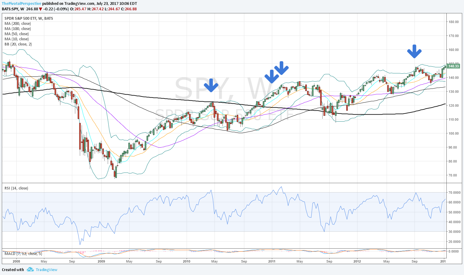
SPY
Q MAs: all above, rising slopes.
M MAs: all above, rising slopes.
Q BBs: upper BB rising sharply, near tag.
M BB: outside band 2/2017, close inside band 3/1. 
Q RSI: strong! 77.56, exceeded prior 2014-15 highs.
M RSI: 2nd month slightly above 70 - TBD.

SPY looks strong but potential upside resistance at the April monthly BB; also watching if monthly RSI drops back under 70 again which would be more threatening. 

QQQ
Q MAs: +
M MAs: +
Q BB: pushing band, which will be sharply higher in Q2.
M BB: 3rd month close outside band - rare.
Q RSI: 80.7, matching 2015 highs.
M RSI: 72.6, better to stay above 70.

QQQ looks incredible here but at some point a profit taking or re-balancing move might drop price back inside the monthly BB. This cannot be ruled out for Q2.

DIA
Q MAs: +
M MAs: +
Q BB: was pushing outside band and closed just inside, band higher in Q2 but likely resistance
M BB: closed outside in 2/2017, down bar inside band 3/2017, likely resistance.
Q RSI: 76.39, above 2014 highs.
M RSI: above 70 each month of 2017 thus far, to watch.

DIA issue is quarterly and monthly Bollinger band resistance. These levels will be higher in Q2 and April but still to watch. 

IWM:
Q MAs: +
M MAs: +
Q BB: near tags 2016 Q4 and 2017 Q1, likely resistance.
M BB: pushing band with some resistance each month since 11/16; band near highs of month each bar of 2017.
Q RSI: at 70, alert for selling - not above 2014-15 highs.
M RSI: 66, not overbought like other.

IWM has had highs near its monthly Bollinger band each month this year and unable to push outside it like each other USA main index (SPY, QQQ, DIA, VTI). In this sense it is relatively weaker. But does that mean leading down or catch up higher?

VTI
Like SPY in nearly all respects but monthly RSI right on 70 makes it more inviting for selling. 

*

Safe havens

TLT
Q MAs: broke 10MA in 16Q4 after closing above each bar since 14Q3. Q20MA testing; more bearish for TLT if below that, potentially bullish above.
M MAs: below 10, 20 and 50MA. 50MA has leveled off after climbing most of this decade. 2/2017 managed to lift above but level looks like resistance 3 of last 4 bars. Below 50MA means visit to 100MA currently 113 and climbing. 
Q BB: Overshoot and drop back inside was part of the top and drop last year.
M BB: We will probably see visit to lower band, adds to downside view.
Q RSI: Less likely to reach extremes compared to stocks.
M RSI: RSI divergence at the top; no buyers at 50 area. 

TLT is testing its quarterly 20MA which is near enough to its monthly 50MA. If these levels act as resistance then things are more bearish for TLT. 

AGG
Q MA: below 10 and 20.
M MA: under 50 since 11/16. 100MA not support.
Q BB: part of 2016 high
M BB: part of 12/2016 low and recent test
Q RSI: like TLT, less likely to reach extremes
M RSI: less likely to see extremes

AGG has stopped going down the last 4 months, but bounce has been weak and think limited upside or down more likely.

GLD
Q MAs: reclaimed 10 but with negative slope, below sharply falling 20 which was resistance at 2016Q3 highs.
M MAs: below 10, above 20, below falling 50, below 100. congestion area but leaning bearish.
Q BB: not tagged since 2012 Q1 divergence high test.
M BB: part of 2016 highs 6-8/2016.
Q RSI: last extreme 2011.
M RSI: last extreme 2011.

GLD will look better if above monthly 10 & 50MAs, currently just below. 

VIX
Q MAs: below all, bullish for stocks.
M MAs: below all, bullish for stocks.
Q BB: tagged on lows what appears to be first time ever 2017Q1; potential reversal.
M BB: not tagged since 6/2016 highs and 7/2014 lows.
Q RSI: like TLT, not as likely to reach extremes compared to stock indexes.
M RSI: even less likely to reach extremes.

XIV
Q MAs: +
M MAs: +
Q BB: insane strong.
M BB: outside band for last 3 months.
Q RSI: not really enough price history for decent judgment; currently 73 better than 70.
M RSI: matching 6/2014 highs which was not the high, but near a key top.

VIX and XIV still both supportive of risk assets. VIX Q BB tag and XIV 3 months outside monthly BB both show possibility of turn, but this is where pivots come in for fine tuning.

*

Sectors of interest

XLF
Q MAs: +
M MAs: +
Q BB: poke outside but close inside bad, possible reversal or at least resistance.
M BB: outside band 11/16 to 2/17, fell back inside 3/17, likely resistance.
Q RSI: nearing 2006 highs.
M RSI: reached 72 2/17, now 67.2, bearish. 

Have to say Wall Streets favorite 2017 sector does not look so hot right now on Q and M Bollinger bands and Q and M RSIs. I don't know if this is a clue that TLT could rally.

SMH
Q MAs: +
M MAs: +
Q BB: outside band 16Q3 and 17Q1.
M BB: pushing band higher without exceeding last 6 months.
Q RSI: 80.
M RSI: 78, nearly matching 2014 highs.

SMH continuing to power up.

*

Global stocks

EEM
Q MAs: First close above 20MA since 2014Q2; although 20MA slightly negative slope, this is likely bullish development.
M MAs: Above all, just cleared 50 and 100 MA.
Q BB: Overshoot and recovery 2015-16 lows. 
M BB: Pushing upper band, possible resistance.
Q RSI: Nowhere near extreme.
M RSI: Low of 31.75 2/2016 lows, plenty of room for up.

Although resistance at upper monthly BB possible, seems like EEM a lot of upside potential.

FXI

Q MAs: Close above 10 and 20MA first time since 2015Q2.
M MAs: Just a bit above 50 and 100.
Q BB: Part of 2016 lows.
M BB: At monthly upper band but downward slope more likely to act as resistance.
Q RSI: Nowhere near extreme.
M RSI: like EEM.

Similar to EEM, but EEM has slight edge on monthly MAs and BBs. Some of this was reason for FXI hedge against EEM long. 

SHComp

Q MAs: above most, below 10MA, rising slopes.
M MAs: above all, but 20MA falling slope, could break.
Q BB: last tagged 2015 highs.
M BB: last tagged 2015 highs, sharply falling upper band likely resistance.
Q RSI: last extreme 2015 highs.
M RSI: 2015 highs all the way to 88, could have dull action for a while.

I think at some point we will see another leg down in this index, but no idea when. Creeper range could continue for 1-2 years more. 

INDA

Q MAs: +
M MAs: +
Q BB: + 
M BB: 1 bar outside 3/17
Q RSI: room to go up
M RSI: room to go up

INDA overshoot of monthly band but considering run XLF and IWM had and QQQ in process (3-4 months outside band) think this is not a huge concern.

RSX

Q MAs: above 10, below falling 20MA which was the 2017 high thus far.
M MAs: above 10 & 20, 50MA resistance last 2 bars.
Q BB: part of 2016 low.
M BB: upper band overshoot & resistance 12/16-2/17 highs.
Q RSI: not a consideration.
M RSI: nowhere near extreme.

RSX would look better above M50MA.

EWZ

Q MAs: falling 20MA resistance.
M MAs: testing 50MA.
Q BB: not a concern.
M BB: near tag on 2/17 highs.
Q RSI: not a factor.
M RSI: not a factor.

Close call, better above M50MA.

DXY

Q MAs: +
M MAs: tagged rising 10MA 3/17 which held as support.
Q BB: divergence high 2016 Q4 part of weakness 2017 Q1.
M BB: overshoot and drop part of 11/16-1/17 high; possible resistance.
Q RSI: 2016 Q4 high 67.9 could have gone higher but didn't.
M RSI: divergence high 12/16.

DXY looks to be supported but at the same time upside limited to upper band currently 102.82 and not much higher for April. DXY sideways or down will support global stocks but have to say some rally looks doable here. 


Other technicals - RSI

We are hearing a lot of chatter about RSI and rightfully so - the move underway is remarkable. But how rare? Let's look at charts. 

I'm going to keep to SPX and NDX, though a full study would use the Dow and go back further in time. 

Sum
In both Q and M charts, above 70 is a sign of strength. This is exactly what happens in bull runs. It is not that terribly uncommon. What you don't want to see is:

1) A move that stops at 70 cold and turns lower. A few of many examples: SPX 2007 Q chart, SPX 1994 M, NDX 2011 M. 
2) A move than returns back under 70 after a long stretch above. Some of these can come back (1998), but negative examples are SPX Q chart in 2000 and both SPX and NDX M charts in 2015.
3) A parabolic move that has RSI values above 85 with price outside the Bollinger bands - risk at this point for a fast drop is significant. Obviously referring to the generational NDX 2000 top here. SPX M chart also reached 85 in 1997 and was outside the band, then spent about 4 months going sideways before another launch. 

Where indexes are now (values not final until quarterly and monthly closes):
SPX Q 77.4, strong and can go higher. Currently not showing divergence.
NDX Q 80.7, strong and near area of 2015 high at 81.4.

SPX M 71.6, better to close above 70 and stay outside of BB than to drop back under and fall back near 70 for the close. 
NDX M 71.5, ditto. 

As it turns out, weekly and daily chart RSIs are also above 70 here. It would take a better data provider to run the stats on the line up of Q, M, W and D charts with RSIs all above 70. I just don't have that right now. It would be on the lower side of total percentile events, but everything depends on environment selection. If you measured all trading quarters, months, weeks and days from 1980 then you might come up with something that appears statistically significant. But if you kept to bull markets when indexes are above all moving averages with rising slopes, then this is what happens a decent amount of the time. Mostly, no. Often enough, yes. An exit signal? No, not the incidence itself. A sell short signal? Definitely not. 

SPX Q
RSI currently 77.4 looks strong as it is above the 2015 peak of 75.8. Quarter is only halfway through, and this value won't be 'on the books' until close. But look at 1980s and 1990s; quarterly chart RSI above 70 is what happens in real bull markets and one cannot say it is uncommon. While we are at it, just look at the 10MA and it has held on Q close since 2011 Q4. 

The danger in SPX Q RSI was falling back under 70 after a long stretch of above. This happened in 2000 Q4 which also coincided with a close under its 10MA, the first since 1990. This didn't nail the top but did keep you long term invested for an amazing stretch. Realize the difference at the 2007 top - SPX was overbought for only 2 quarters and then clearly rejected in 2007 Q4, falling to 66. 2008 Q1 closed under its 10MA and from there trend was down until its 100MA a year later. 

NDX Q
We're not in the 1990s yet with quarterly chart RSI at 80.7 compared to 96 then but hey, NDX Q RSI totally overbought from July 2013 on. Bullish, and yet not too bullish. When NDX reached the heights of the 2000 top it did have a faster drop, going from outside the BB to under 10MA in 3 quarters. RSI was a still healthy 76.9 in 2000 Q3, then fell to 57 in Q4. That was quite a walloping for the latecomers, basically 1999 Q4 to 2000 Q1. 

SPX M, 2000+
Looking at this chart you might be more concerned, as only a handful of monthly bars are above 70. Even so, above 70 is better than stopping cold at 70 and turning lower. 

SPX M 1980-2000
But 1983-1987 had frequent moves into overbought territory. 10/1987 did come out of the blue from RSI perspective. SPX monthly chart entirely overbought from 5/1995 to 8/1998. The next phase up in 1999 and 2000 the chart showed very clear divergence, with RSI highs getting lower and lower over more than a year before the big rollover down. 

NDX M 2000+
NDX monthly chart RSI above 70 less common from 2000 on, but not unheard of per the 8/2013 - 7/2015 run. 

NDX M 1995+
Showing the chart this way to keep consistent with SPX periods. This did bounce around having moves from above 70 to below several times 1997-1998. From there purely overbought with RSI highs at 88, with a huge wick on the monthly chart before the walloping. 

Long term RSIs

SPX Q chart
Note the RSI high in 2014 Q4, 2015 Q1 and 2015 Q2 with 3 closes 75.4-75.8. The quarterly bar is not even half done but RSI at 75.6 means testing the highs since the 1990s. RSI can go significantly higher evidenced by 1998 Q1 high at 95 (!!!), but for now clearing the 75 would be a sign of strength in the market. 

SPX M
RSI for Jan closed at 68.08 and currently 69.06; like 75 area on quarterly chart, clearing 70 without selling pressure would be a sign of strength. Moves that stop at 70 and see selling - notably 5/2015 for example, or 3/2000 - can be more bearish. 

NDX Q
2015 RSI highs were 80-81, and now back at 79.5.

NDX M
Like SPX, approaching 70 area. Above would be sign of strength, selling here more like 4/2011 or 3/2012.

INDU Q
RSI reaching above 73.6 means highest RSI since the 90s, so far a sign of strength. 

INDU M
Despite January's near doji bar with RSI at 70.5 and top of the monthly BB, so far February up! RSI higher and pushing the band. 

RUT Q
RSI currently 70.17 after closing 2016 Q4 at 69.44. Sign of strength to be over 70 but we could still see a selling reaction from this area. 

RUT M
Not as high as the others and still a ways from 70. 

Other technicals - daily closes and average true range

I talked about quarterly and monthly closes at various points on long term charts last year, but daily close levels are also a tell. 

The 12/13/2016 close was 227.76. Thus far the 1/6/2017 price high is 227.75. Not a coincidence!

Now I'm going to put an indicator called Average True Range on the lower panel. This is a measure of 2 day range that includes gaps (so not just intraday high to low). You will notice that this has been lower for only a few days of the last year or so. And those days were key highs in a range. 

These are related concepts because as stocks settle into a range after a healthy move up, there will be selling at the highs of the range (often measured by closes). Also, more likely to have dull action, less volume, and lower ranges.

I have been bullish since election to December, and both times went under 100% long quickly took off hedges & shorts and back up to leverage long. (First reduction wrong and small loss, second reduction gain on both hedges and shorts). Leverage longs have made money as well. But due to what we're seeing above, taking gains and reducing exposure maybe the next best move. 

Signs of strength

There are many things to list so instead of charts here is just a list of items on main USA indexes.

Main point here is that train needs to slow down before reversing so with multiple signs of strength across timeframes and USA indexes, higher highs likely ahead. Also keep in mind the Pivotal Promise currently pointing to 2017 SPX YR1 2408 at current levels. This will continue to change until 12/31/2016. 

Quarterly charts
SPX RSI 75, currently nixing divergence from previous 2015 highs also 3 bars on 75.
NDX above 2000 top 4816
INDU RSI 74, also nixing more threatening divergence high near 70.
Of course, above 2015 highs on all main USA indexes except NYA.

Monthly charts
SPX pushing the monthly BB; amazing to think last tag of monthly BB 12/2013. (June and July 2016 close but not quite according to current view)
INDU, RUT, VTI all *outside* monthly BBs!

Weekly charts
SPX, INDU, RUT, NYA, VTI all outside weekly BBs; only INDU and RUT have RSI 70+.

Advance decline volume difference - no divergence on daily chart, weekly chart plenty of room to move up. 

Breadth

There are many ways to analyze strength in the market. Usually when the market advance is strong, it is a positive - meaning that higher highs with some sign of weakness is yet to come. 

With that idea in mind, here's the advance decline volume difference chart with a 10MA in blue. Note the recent spike up to 1000. This is a healthy advance, exceeded only twice in the last twelve months or so: early October 2015, which launched a terrific rally that peaked in early November; and early March 2016, which again took 4-6 weeks to top out. Several other rallies matched what we just saw: mid February 2016, part of the rally off the lows; mid April 2016, which was a key high; early July 2016, again preceding a strong rally.

So the only one of these at a top was the April 2016 peak, which itself was a lower high from March which was followed by obvious deterioration going back towards the zero line and under. 

The most likely thing here is higher index highs on weaker breadth, not an immediate top and drop. If sentiment meters get more toppy (see yesterday's post) we are more likely to see a shakeout and more digestion of recent gains, but I don't think the terrific Trump move is done just yet. 

We can also expand our view to the weekly chart. This shows how few real buyers there were before the election, as this trough was exceeded only a handful of times this decade: June 2010, May 2012, November 2012, August 2015 and January 2016. These were all major lows. I'll be watching that the 10MA can continue into positive territory. 

Divergence

Savvy traders know how to spot divergence. This is a technical term that really involves rate of change. If something is still going down, but going down at a slower pace, then it is more likely that up is the next move. This can work as part of logic to buy, or to cover shorts. 

It can also work as a tool to hold strong positions. If you spot an immanent move and get it right, then it often pays to "wait for divergence" before an exit, ie a slowing of the pace of the up move. 

As soon as one starts using Bollinger bands and moving averages then all timeframes are in play from quarterly or even down to 5 minutes or less if you want to daytrade. Here are a couple recent examples.

DIA daily with Bollinger band below. There are 4 arrows on recent lows. 
#1 9/9 plunge - low and close outside BB
#2 9/14 - less movement but low and close still outside BB
#3 10/13 - low outside BB, close within
#4 10/21 - low and close all within BB

This is what I mean by building bullish divergences. A weak market would have opened on Friday and kept on going down to have another low & close outside the BB.

It is also common to watch for divergence with momentum tools like RSI. Check the daily DXY chart below.

The move powered up to a reading above 70 - 75.71 on the 10/12 high. Anything above 70 means enthusiastic buying. There was an apparent divergence on 10/14 with lower RSI high at 71.83. The next move after that was 3 day consolidation to a sharply rising 10MA which provided the boost for another launch, and RSI is again up there at 74.21. I consider that close enough - a negative divergence pattern would have stopped at 70 again. Also note the power move outside the Bollinger bands twice. The third time is inside, and that is beginning to slow, but with strong move moves and RSI strong my conclusion is - going higher. 

INDU Q
I consider this the most threatening chart for USA stock bull market due to the glaring RSI divergence with RSI stopping just under 70 on recent 2016 Q3 high (69.27 to be exact). Compare this to the power move above 70 in 2014-15, which was preceded by a close outside the Q BB in 2013, a sign of strength. Both of those meant market was likely to go higher, and it did. But now we just saw a slightly higher price high above 2015 highs - but not a close high mind you - on textbook RSI divergence and the Q BB leveling out. Even if a big drop is not immanent, we could be in for a long sideways or upside limited period, especially if $USD strength continues.